Display Code
pacman::p_load(tidyverse,dplyr, ggthemes,colorspace,ggiraph,
               plotly,patchwork,lubridate,
ggrepel,ggdist)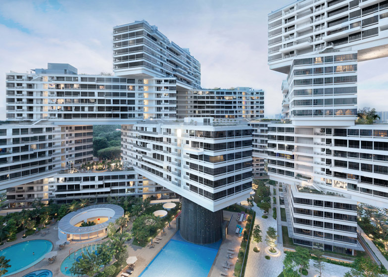 [Source: The Interlace] (https://www.dezeen.com/2014/10/07/ole-scheeren-the-interlace-important-prototype-housing-waf-2014/)
80% of Singapore residents reside in public housing while 20% resides in private housing. In the private housing market, land ownership is divided into two parts: land and strata. For landed property, the plot of land belongs to the owner while in strata property, the plot of land is jointly owned by the legal owners in the same development (The Business Times, 2022). A detached house, commonly known as bungalow, semi-detached house and terrace house may possess either be landed or strata titled.
In this exercise, we aim to apply different data visualisation design practices and principles in improving on the Take-Home Exercise 1’s output of a fellow coursemate
In this section, we will be preparing our R environment and data set.
The following functions will be loaded using ‘pacman:p_load()’ in R Packages to facilitate the data preparation and analysis process.
pacman::p_load(tidyverse,dplyr, ggthemes,colorspace,ggiraph,
plotly,patchwork,lubridate,
ggrepel,ggdist)q5data <- read_csv("data/ResidentialTransaction20240414220633.csv")A total of 4,902 rows and 21 columns. If we want to look at the attributes of the data, we can use glimpse() function as seen in next section 2.3.
glimpse(q5data)Rows: 4,902
Columns: 21
$ `Project Name` <chr> "THE LANDMARK", "POLLEN COLLECTION", "SK…
$ `Transacted Price ($)` <dbl> 2726888, 3850000, 2346000, 2190000, 1954…
$ `Area (SQFT)` <dbl> 1076.40, 1808.35, 1087.16, 807.30, 796.5…
$ `Unit Price ($ PSF)` <dbl> 2533, 2129, 2158, 2713, 2453, 2577, 838,…
$ `Sale Date` <chr> "01 Jan 2024", "01 Jan 2024", "01 Jan 20…
$ Address <chr> "173 CHIN SWEE ROAD #22-11", "34 POLLEN …
$ `Type of Sale` <chr> "New Sale", "New Sale", "New Sale", "New…
$ `Type of Area` <chr> "Strata", "Land", "Strata", "Strata", "S…
$ `Area (SQM)` <dbl> 100.0, 168.0, 101.0, 75.0, 74.0, 123.0, …
$ `Unit Price ($ PSM)` <dbl> 27269, 22917, 23228, 29200, 26405, 27741…
$ `Nett Price($)` <chr> "-", "-", "-", "-", "-", "-", "-", "-", …
$ `Property Type` <chr> "Condominium", "Terrace House", "Apartme…
$ `Number of Units` <dbl> 1, 1, 1, 1, 1, 1, 1, 1, 1, 1, 1, 1, 1, 1…
$ Tenure <chr> "99 yrs from 28/08/2020", "99 yrs from 0…
$ `Completion Date` <chr> "Uncompleted", "Uncompleted", "Uncomplet…
$ `Purchaser Address Indicator` <chr> "Private", "N.A", "HDB", "N.A", "Private…
$ `Postal Code` <chr> "169878", "807233", "469657", "118992", …
$ `Postal District` <chr> "03", "28", "16", "05", "21", "21", "28"…
$ `Postal Sector` <chr> "16", "80", "46", "11", "59", "58", "79"…
$ `Planning Region` <chr> "Central Region", "North East Region", "…
$ `Planning Area` <chr> "Outram", "Serangoon", "Bedok", "Queenst…As evidenced, glimpse() function indicates the variable, the type of variable (chr, dpl, num) and the subvariables within the variable.
As there is no decimal points in this data set, the variable “Transacted Price ($)” will be changed to number instead of double precision.
# Convert "Transacted Price ($)" to numeric
q5data$`Transacted Price ($)` <- as.numeric(gsub("[^0-9.]", "", q5data$`Transacted Price ($)`))The average of each property type such as Condominium, Terrace House will be calculate in facilitating the data makeover process in the later sections.
The More You Know
The %>% operator, pronounced as “then”, is part of the magrittr package in R. It’s used for piping, which allows you to perform a sequence of operations on data without nested function calls, making your code more readable and concise.
mean_prices <- q5data %>%
 group_by(`Property Type`, `Type of Area`) %>%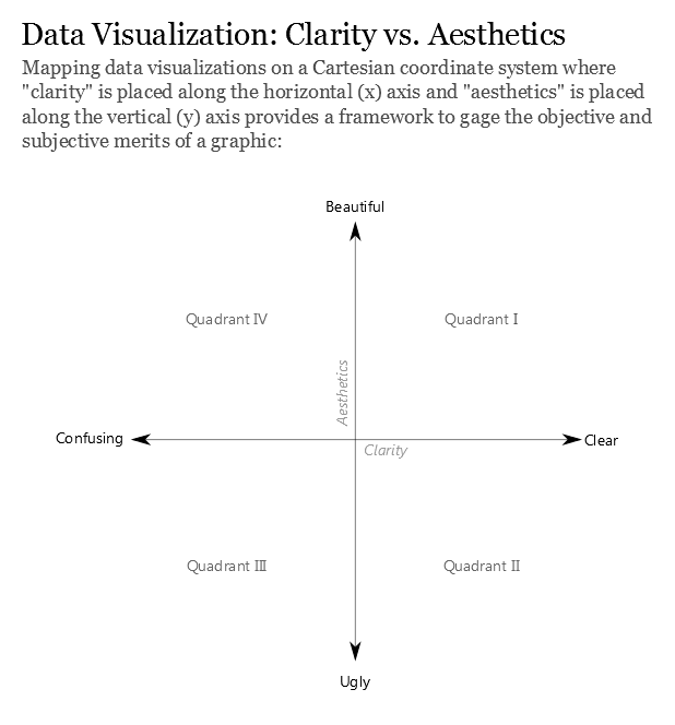
summarise(mean_price = mean(`Transacted Price ($)`), .groups = "drop")The critic will be based Figure 2 and the article “Data Visualization: Clarity or Aesthetics” acts as a scaffold of assessment. The diagram of the coordinate system below will served as an overall assessment of the visualisation.
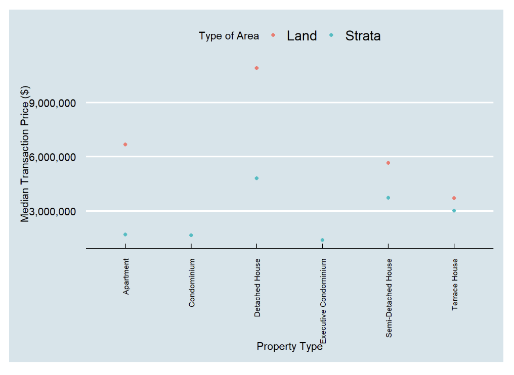
The design is elegant; is not bombarded with mouthful of information. It allows readers to examine the median transacted prices of each propery type in the type of area at a glance. The background colour is easy on the user’s eyes; not too bright nor contrasting. Good consideration.
In the context of Jones (2012), the author defined clarity as “how quickly and effectively it imparts to the audience an accurate understanding of some fundamental truth about the real world”. The two metrics that will be used in this section as per follows:
1. At one glance, does it tell a story?
2. Upon examination, Is it effective in telling me a story within the visulisation?
Comments:
The dots that represents the median price of each property type is rather small. Audience may not effectively picked up the median price of the size of the dot
Solution: To increase dotsize
The lack of the actual median price being displayed beside the dot does not tell the audience
Solution: To indicate the average price beside the dot
The use of median prices might be one of the market’s indicator for the transactions prices. However, average transacted prices is also an important market indicator despite its sensitivity to outlier transactions. Stakeholders such as potential buyers do want to know the average transacted price too as it may indicate they potentially need to purchase the property.
Solution: Box & Whisker plot will be introduced instead as the audience is able to clearly visualise the distribution of the transacted price. The box & whisker plot will reflect the following: 1. Lower & Upper Quantile 2. Minimum & Maximum Value 3. Outliers 4. Average price 5. Median price
Jones (2012) dictates that aesthetics should only be discussed once clarity has been achieved. In the previous section, shortfalls has been discussed alongside proposed solutions. Therefore, upon achieving clarity, aesthetics can be explored.
The inverted words of the property type makes it difficult for the audience to comprehend each column. Solution:
Lack of title in this visualisation - Audience might not know which quarter or year this data was obtained from
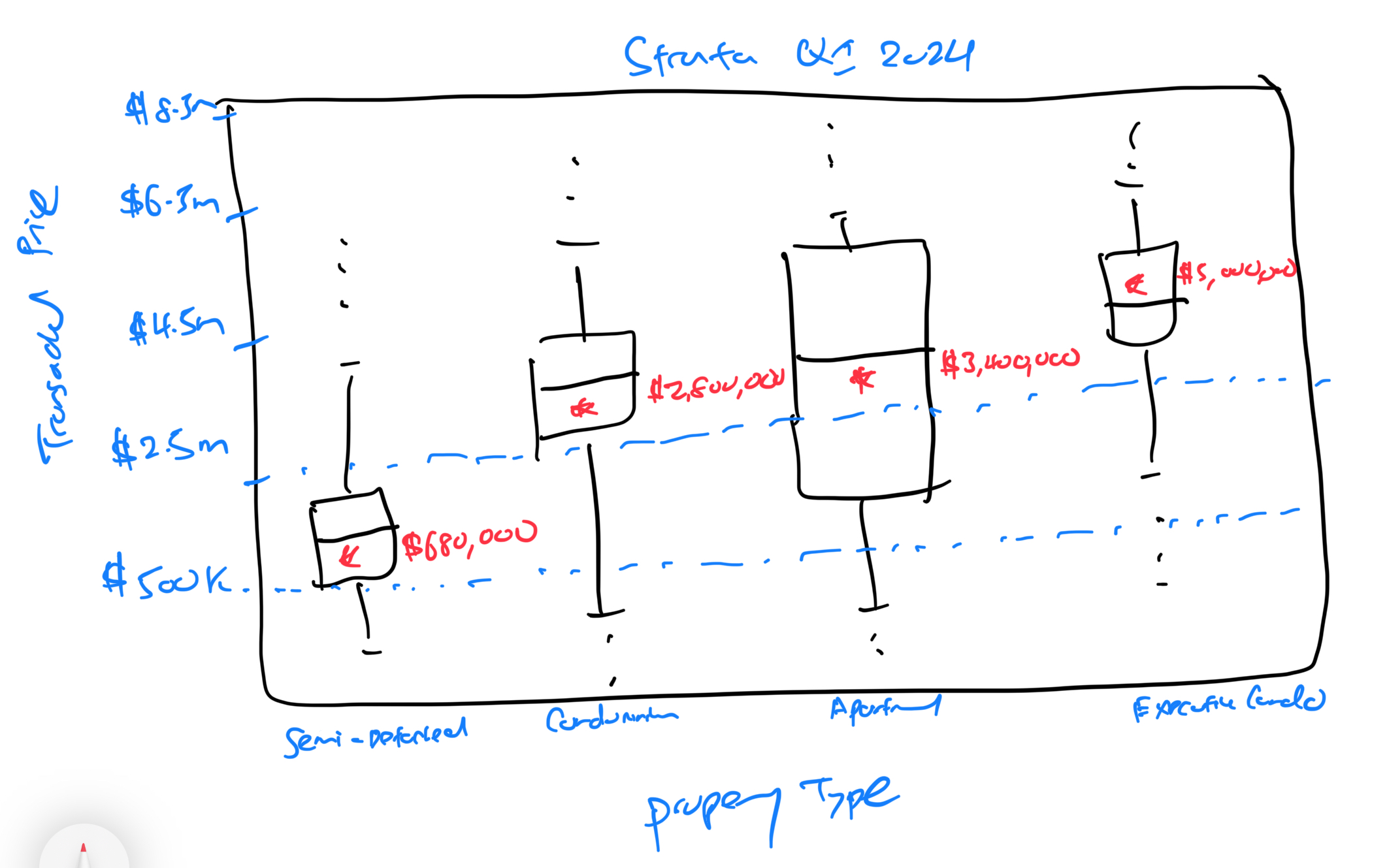
A rough sketch of the box and whiskers plot has been made in facilitating the ideation process.
Attempt 1 - Clarity:
The data was populated into a box and whiskers plot and the below plot was generated. Noticed that the plots appear compressed especially in Strata due to the presence of outlier transaction prices seen in the Detached House. Thus, in this instance, it is practical to remove these 2 outliers transactions.
ggplot(q5data, aes(x = `Transacted Price ($)`, y = `Property Type`)) +
  geom_boxplot() +
  scale_x_continuous(limits = c(500000, 40500000), breaks = seq(500000, 40500000, 5000000), labels = scales::dollar_format(prefix = "$")) +
  facet_wrap(~`Type of Area`, ncol = 1, labeller = labeller(`Type of Area` = c(Strata = "Strata"))) +
  labs(x = "Transacted Price ($)", y = NULL) +
  theme_minimal(base_size = 8) +
  theme(axis.text = element_text(size = 8),
        strip.text = element_text(size = 10),
        legend.position = "none")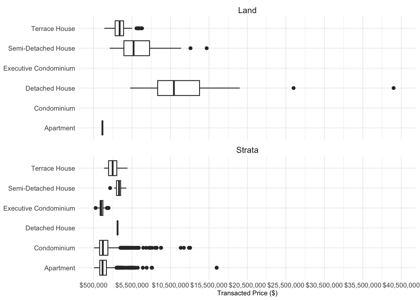
Attempt 2 - Clarity:
By limiting the x axis to $20,500,000, the two outlier transactions were removed. At a first glance, it is clear that there are no transactions of Executive Condomimium and Condominium within the Strata type. Additionally, there is only one transaction for ‘Apartment’ in Land and ‘Detached House’ in Strta.
ggplot(q5data, aes(x = `Transacted Price ($)`, y = `Property Type`)) +
  geom_boxplot() +
  scale_x_continuous(limits = c(500000, 20500000), breaks = seq(500000, 20500000, 5000000), labels = scales::dollar_format(prefix = "$")) +
  facet_wrap(~`Type of Area`, ncol = 1, labeller = labeller(`Type of Area` = c(Strata = "Strata"))) +
  labs(x = "Transacted Price ($)", y = NULL) +
  theme_minimal(base_size = 8) +
  theme(axis.text = element_text(size = 8),
        strip.text = element_text(size = 10),
        legend.position = "none")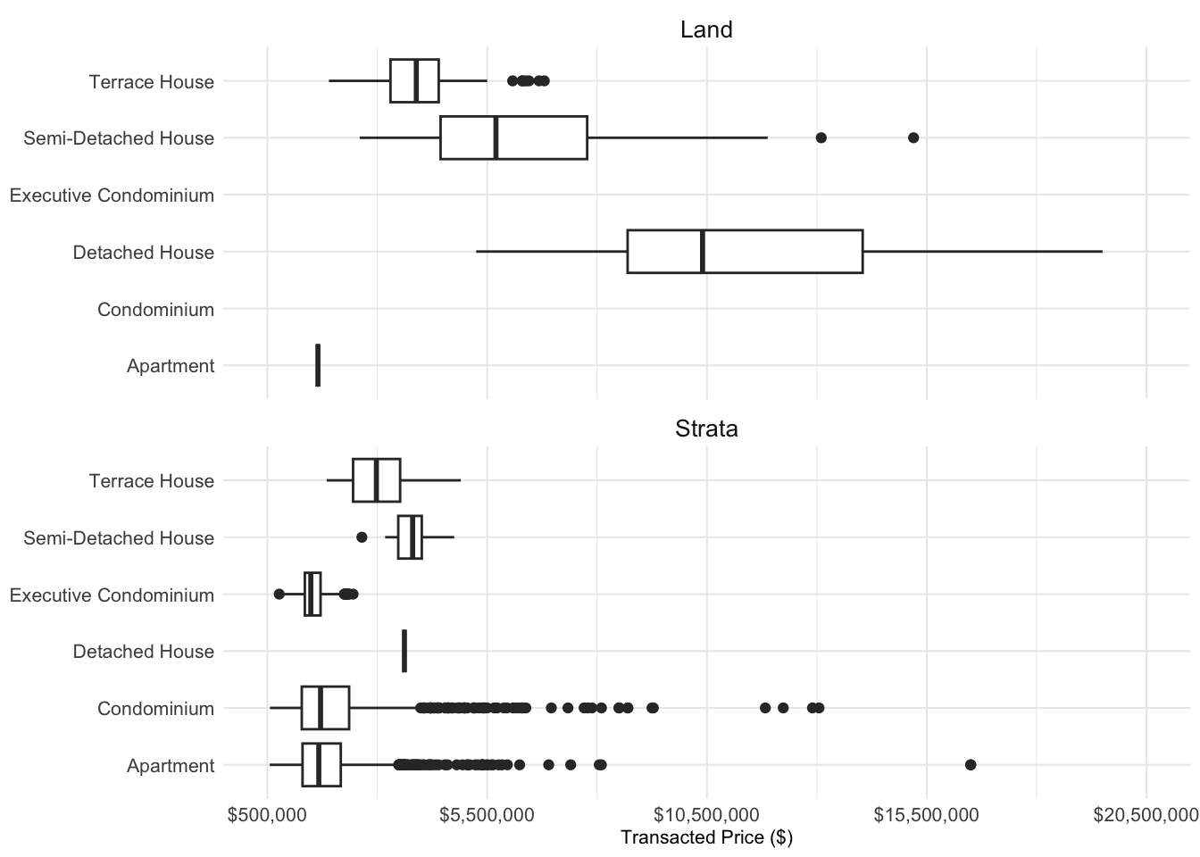
Attempt 3 - Clarity:
An attempt has been made to allow the box and whiskers plot to be posiitoned vertically instead of horizontally as it may faciliate in assessing the trasanced price from lowest to the highest. However, the plot appeared compressed and might be secondary to orientation of the diagram. Hence the decision was made to retain the original plot as seen in Attempt 2.
ggplot(q5data, aes(x = `Property Type`, y = `Transacted Price ($)`)) +
  geom_boxplot() +
  scale_y_continuous(limits = c(500000, 20500000), breaks = seq(500000, 20500000, 5000000), labels = scales::dollar_format(prefix = "$")) +
  facet_wrap(~`Type of Area`, ncol = 1, labeller = labeller(`Type of Area` = c(Strata = "Strata"))) +
  labs(x = NULL, y = "Transacted Price ($)") +
  theme_minimal(base_size = 8) +
  theme(axis.text = element_text(size = 8),
        strip.text = element_text(size = 10),
        legend.position = "none")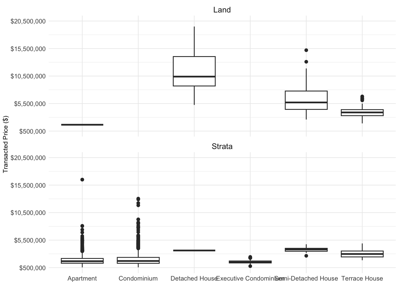
Attempt 4 - Clarity:
In ensuring the clarity, the average transacted prices for each property type has been added alongside the actual average transacted figure and in facilitating the flow of vision, the color “blue” has been used.
ggplot(q5data, aes(x = `Transacted Price ($)`, y = `Property Type`)) +
  geom_boxplot() +
  stat_summary(fun.y = mean, geom = "point", shape = 18, size = 2, color = "blue") +
  geom_text(data = mean_prices, aes(label = scales::dollar_format()(mean_price), y = `Property Type`, x = mean_price), vjust = 2, hjust= -0.5, size = 2.5, color="blue") +
  scale_x_continuous(limits = c(500000, 20500000), breaks = seq(500000, 20500000, 5000000), labels = scales::dollar_format(prefix = "$")) +
  facet_wrap(~`Type of Area`, ncol = 1, labeller = labeller(`Type of Area` = c(Strata = "Strata"))) +
  labs(x = "Transacted Price ($)", y = NULL) +
  theme_minimal(base_size = 8) +
  theme(axis.text = element_text(size = 8),
        strip.text = element_text(size = 10),
        legend.position = "none")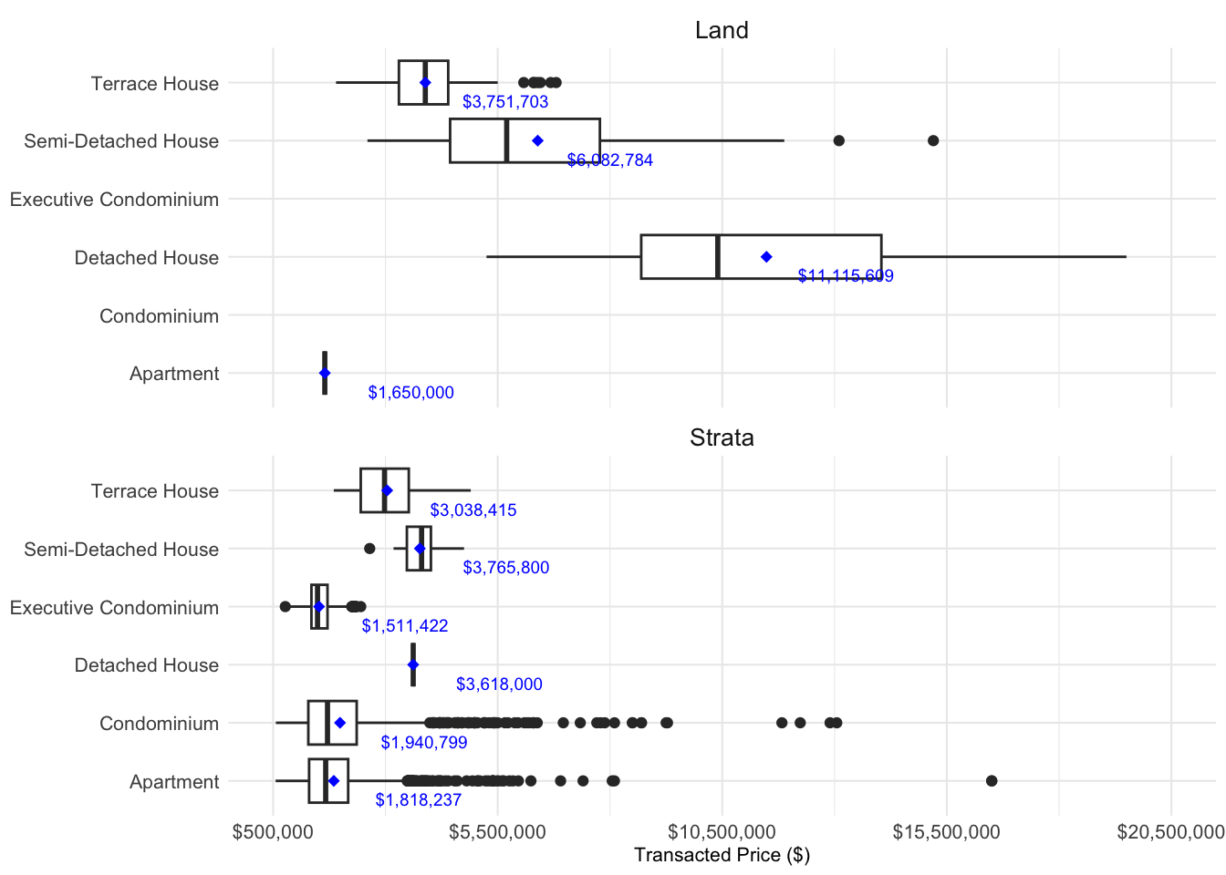
Attempt 5 - Aesthetics:
Each individual property type has been assigned a colour to faciliate viewing. The colour is consistent in both Land and Strata. For example: The use of red colour is standardised for Terrace House in Land and Strata type. However, visualisation as a whole, appears bright which not not aid viewing. Hence the last attempt will change the background colour.
#Vector of colors for each Property Type
property_type_colors <- c("Terrace House" = "red", "Semi-Detached House" = "blue",
                           "Detached House" = "green", "Condominium" = "purple",
                           "Executive Condominium" = "orange")

#Boxplot
ggplot(q5data, aes(x = `Transacted Price ($)`, y = `Property Type`, color = `Property Type`)) +
 geom_boxplot() +
 stat_summary(fun.y = mean, geom = "point", shape = 18, size = 2) +
 geom_text(data = mean_prices, aes(label = scales::dollar_format()(mean_price), y = `Property Type`, x = mean_price), vjust = 2, hjust = -0.5, size = 2.5) +
 scale_color_manual(values = property_type_colors) +
 scale_x_continuous(limits = c(500000, 20500000), breaks = seq(500000, 20500000, 5000000), labels = scales::dollar_format(prefix = "$")) +
 facet_wrap(~`Type of Area`, ncol = 1, labeller = labeller(`Type of Area` = c(Strata = "Strata"))) +
 labs(x = "Transacted Price ($)", y = NULL) +
 theme_minimal(base_size = 8) +
 theme(axis.text = element_text(size = 8),
       strip.text = element_text(size = 10),
       legend.position = "none")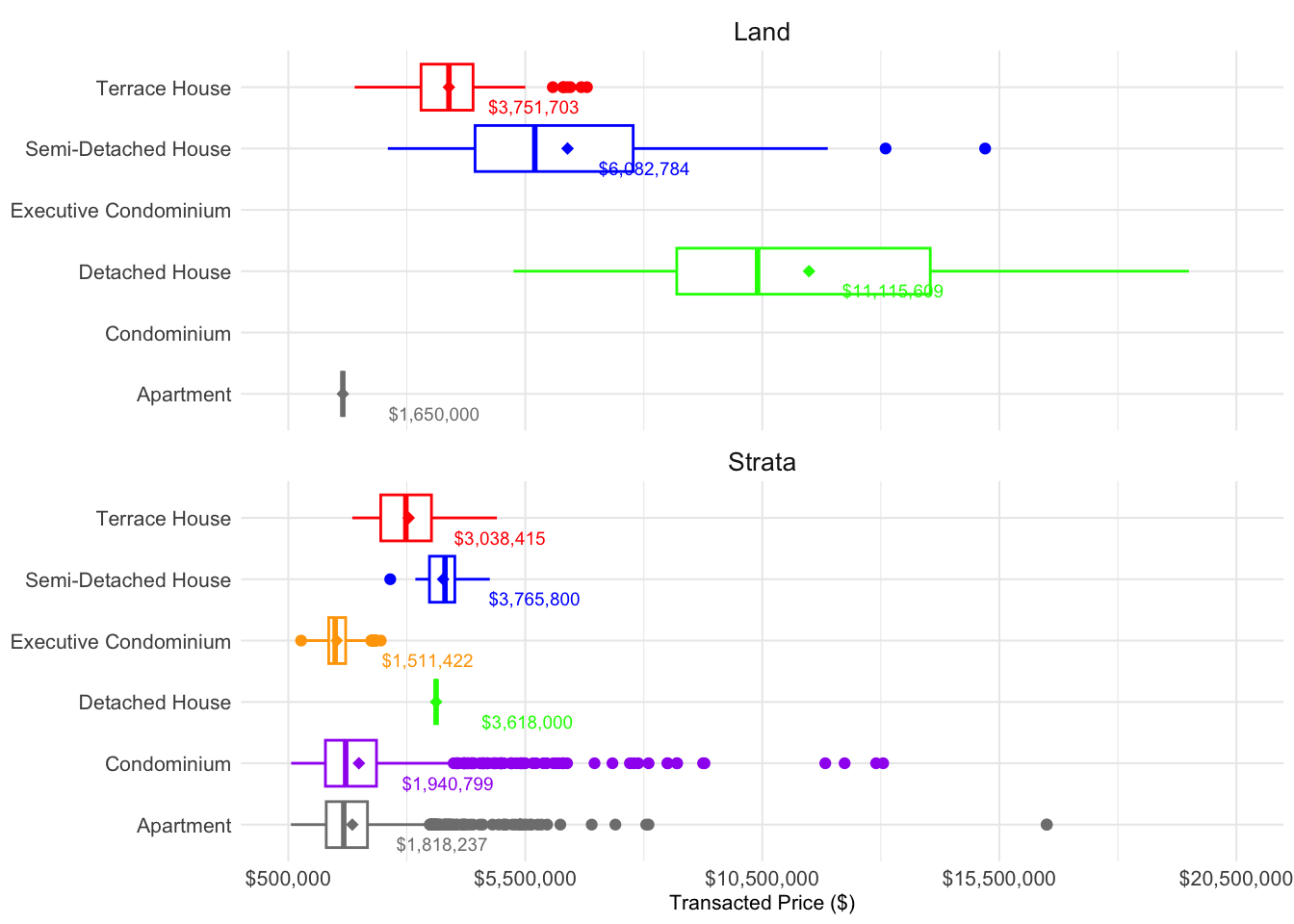
#Vector of colors for each Property Type
property_type_colors <- c("Terrace House" = "red", "Semi-Detached House" = "blue",
                           "Detached House" = "darkgreen", "Condominium" = "purple",
                           "Executive Condominium" = "orange")

#Boxplot
ggplot(q5data, aes(x = `Transacted Price ($)`, y = `Property Type`, color = `Property Type`)) +
 geom_boxplot() +
 stat_summary(fun.y = mean, geom = "point", shape = 18, size = 2) +
 geom_text(data = mean_prices, aes(label = scales::dollar_format()(mean_price), y = `Property Type`, x = mean_price), vjust = 3, size = 2.2, fontface = "bold") +
 scale_color_manual(values = property_type_colors) +
 scale_x_continuous(limits = c(500000, 20500000), breaks = seq(500000, 20500000, 5000000), labels = scales::dollar_format(prefix = "$")) +
 facet_wrap(~`Type of Area`, ncol = 1, labeller = labeller(`Type of Area` = c(Strata = "Strata"))) +
 labs(x = "Transacted Price ($)", y = NULL, title = "Transacted Prices of Private Residential Market in Q12024") +
 theme_minimal(base_size = 8) +
 theme(axis.text = element_text(size = 8),
       strip.text = element_text(size = 10),
       legend.position = "none",
       plot.background = element_rect(fill = "lightblue"))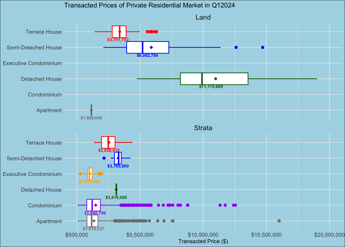
Overall, the makeover enhanced the clarity and aesthetics of the former visulisation. It allows the audience to visualise almost the full spectrum of the data alongside its statistics.
a\. The visualisation might look cluttered as two diagrams of box and whiskers plot were chunked into one. However, the comparison was necessary in visualing the transacted prices using the same x-axis.

b\. The numbers of the average transacted price labelled within each box and whisper plot were small and some of the numbers were cut out such as Apartment in both Land and Strata.

c\. Two outliers were eradicated as the box and whiskers plot appeared very narrowed. Thus the full spectrum of the outliers was not shown.Coming Soon.
Jones, B. (2012). Data Visualization: Clarity or Aesthetics. Retrieved from https://dataremixed.com/2012/05/data-visualization-clarity-or-aesthetics/
The Business Times. (2022). Landed home prices set to stay firm, if not trend upwards. Retrieved from https://www.businesstimes.com.sg/property/landed-home-prices-set-stay-firm-if-not-trend-upwards